
Last updated: September 20, 2026
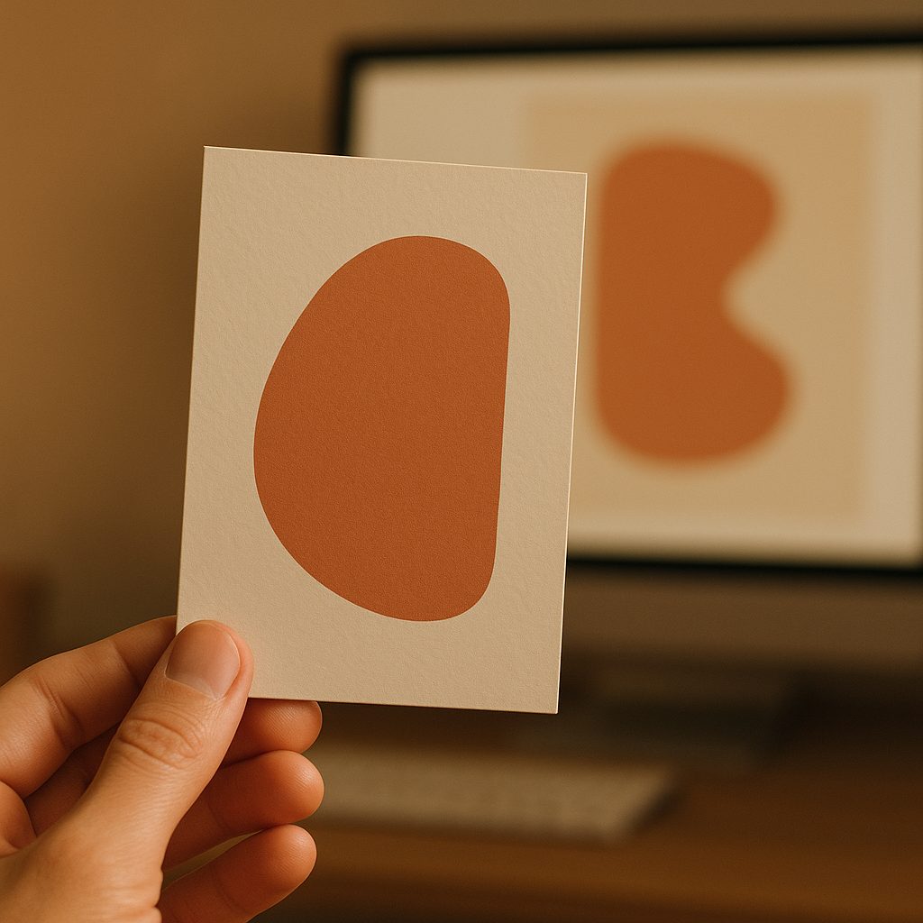
We have entered the era of infinite flat images. A generated picture of a product, a package, a whole brand world can be conjured in seconds, and the feed is filling with synthetic everything, all of it competent, all of it slightly the same. In that environment something quietly valuable is happening to the physical object: it is becoming proof. When anything on a screen might be fabricated, the thing a customer can actually pick up and feel becomes a brand’s most convincing evidence that it is real, that someone made a decision, that effort was spent. The package is turning into the last honest surface a brand has.
Table of Contents
- Texture is proof of effort
- The things a render can never show
- Real color is a craft, not a filter
- You have to hold it, so hold it before you commit
- The takeaway
- FAQ
This is not nostalgia. It is a practical advantage, and it is available to any brand willing to put its craft where a customer’s hands are. Here is why the tactile package is winning attention in an AI-saturated market, and what actually delivers the feeling.
Texture is proof of effort
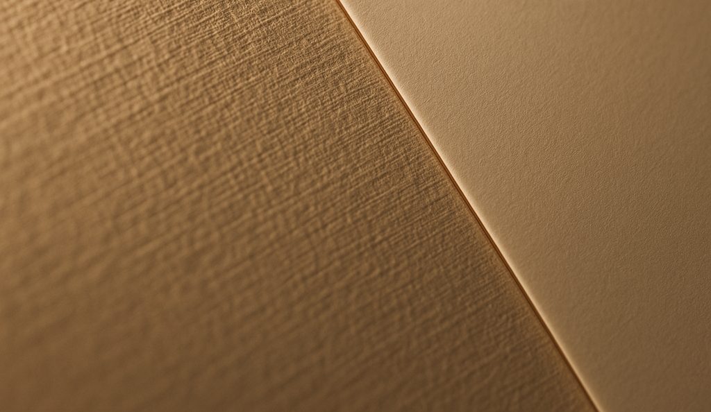
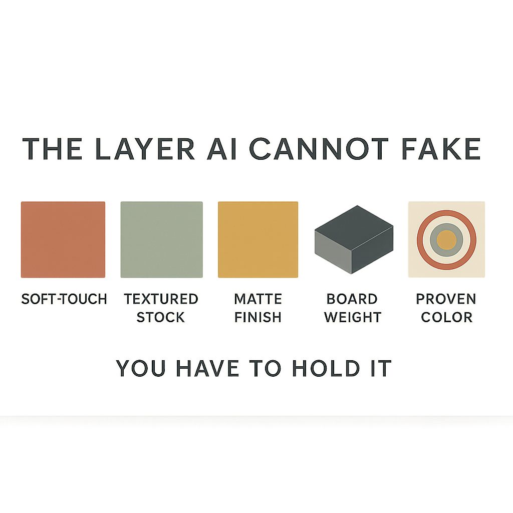
The reason a beautifully finished package feels expensive is that it visibly, physically took effort to make. A generated image can imitate the look of craft. It cannot produce the craft, because craft in packaging is not an appearance, it is a set of physical decisions made in a material. A soft-touch panel with a suede drag under the finger, the linen weave of a textured stock, the density of a heavier board that does not flex when you pick it up: these register as care because they are care, converted into something a hand can read. In a market flooded with effortless images, the object that clearly took effort stands out precisely because effort has become rare.
The things a render can never show
Walk through what a screen genuinely cannot deliver, and the tactile advantage gets concrete. It cannot give you weight, the reassuring heft of a heavier board that signals quality before a word is read. It cannot give you the specific matte drag of a soft-touch panel under the thumb, or the linen weave of a textured stock catching the light differently as you turn it. It cannot give you the sound a rigid board makes when it is set down, or the way a well-cut fold closes without argument. Every one of these is a physical event that only exists in the hand. A customer holding a package registers all of them in an instant, below conscious thought, and reaches a verdict: this is the real thing, made by people who cared.
Real color is a craft, not a filter
There is one more thing the screen cannot promise, and it is the least obvious: color that is actually right, and right every time. On a monitor, color is a suggestion that changes with every device and every light. On a physical package, color is a fact, and getting that fact correct on the first run and identical on the tenth is a genuine discipline. A brand color that holds across every reorder is itself a mark of craft, a signal that someone is managing the print rather than hoping for it. We color-manage every job to G7 and GMG standards, so the exact color a brand approves is the color that reaches a customer’s hands, run after run, with none of the drift that quietly reads as cheap.
You have to hold it, so hold it before you commit
The whole argument of this piece is that the physical object carries what a screen cannot, which means judging tactile packaging on a screen defeats the point. A soft-touch panel, the grain of a textured stock, the weight of a board: these have to be evaluated in the hand, by the people making the decision. This is exactly what physical prototyping is for. We can typically turn a real proof within a week, printed and finished on the actual stock, so a brand can feel the craft before it commits to producing it. A render will tell you what a finish looks like. Only the real thing tells you what it is worth.
The takeaway
As images get cheaper and more synthetic, the physical package gets more valuable, because it is the one surface a brand cannot fake and a competitor cannot generate. Texture is proof of effort. Weight, a soft-touch drag, the grain of a textured stock, and color that holds are things a customer can only experience in the hand, and experiencing them builds a kind of trust no feed can manufacture. The move is to lean into exactly what AI cannot do: make something real, make it tactile, print it to a standard, and put it where a customer’s hands are. In 2026 that is not a nostalgic choice. It is a competitive one.
FAQ
Why does physical packaging matter more in an AI era?
Because when any image might be fabricated, the object a customer can pick up becomes the proof. A generated picture can imitate the look of craft; it cannot produce the craft, which is a set of physical decisions made in a material.
What can a customer feel that a render cannot show?
Weight, the matte drag of a soft-touch panel, the linen weave of a textured stock catching the light, the way a well-cut fold closes. Each is a physical event that only exists in the hand and is registered below conscious thought.
What makes packaging feel premium?
Material decisions rather than visual ones: a heavier board that does not flex, a soft-touch or textured surface the hand reads as considered, and colour that is correct on the first run and identical on the tenth.
Should I approve packaging from a digital proof?
Not for anything tactile. Judging a physical package on a screen defeats the point of making it physical. A printed proof on the actual stock, typically within a week, is what lets the decision be made in the hand.
Feel it before you commit to it
A render tells you what a finish looks like. Only the real thing tells you what it is worth. Request a quote from White Graphics to prototype the real stock and finish, or read how colour is held to a standard on the quality control page.
About the publisher
White Graphics is a G7 Master qualified custom label and packaging company managed out of Naperville, Illinois, serving food, beverage, supplement, cosmetic, and household-product brands across North America since 1972. Learn more about the company or see the full range of capabilities.