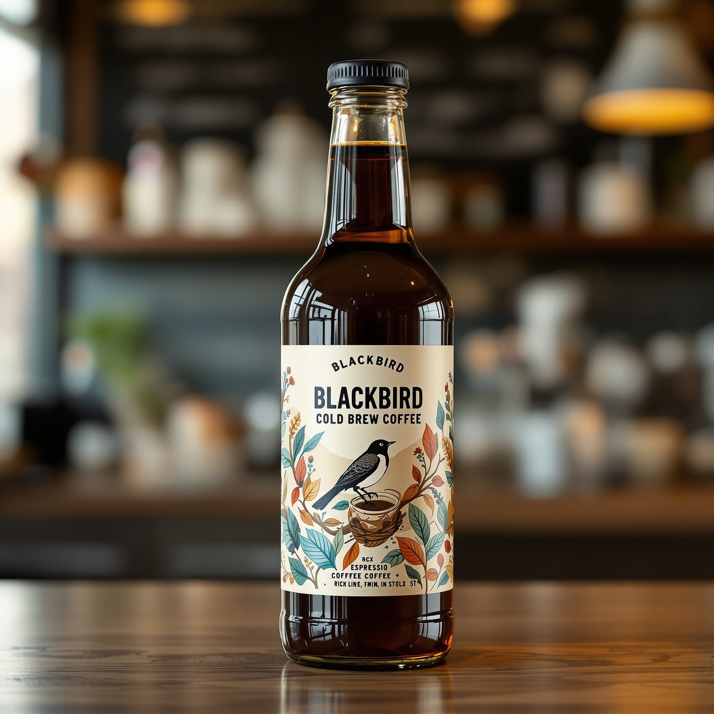
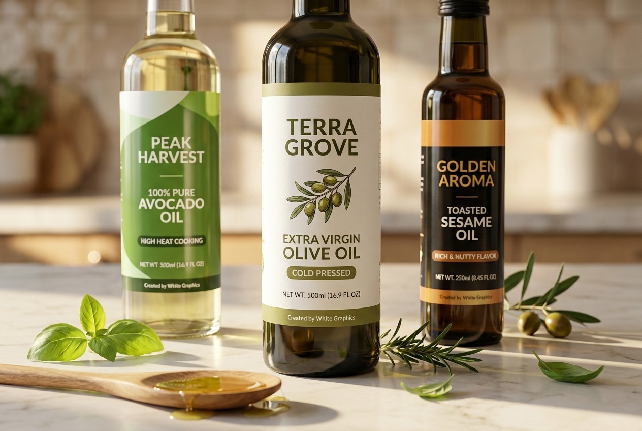

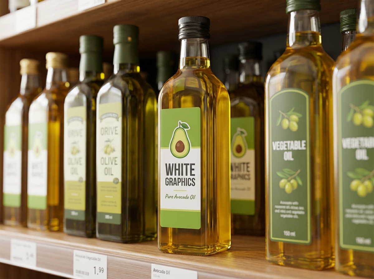
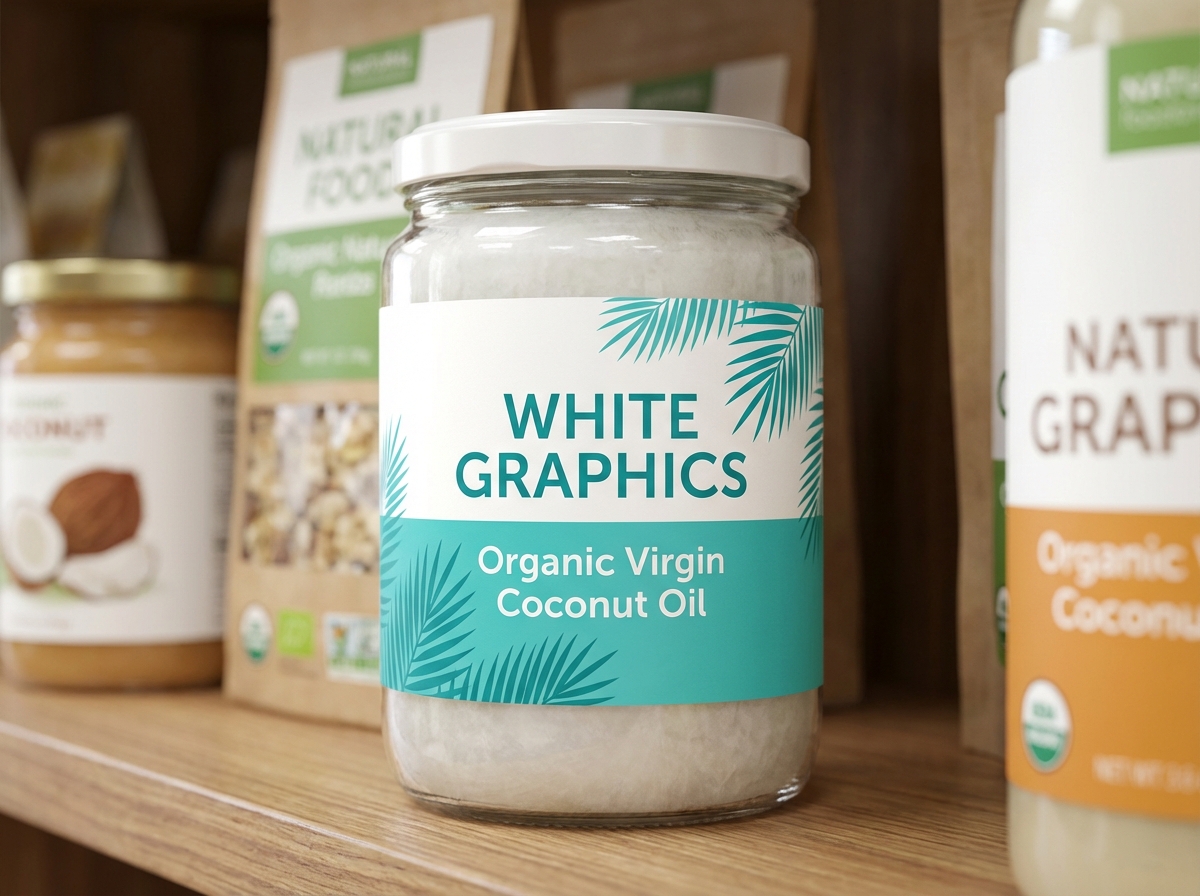
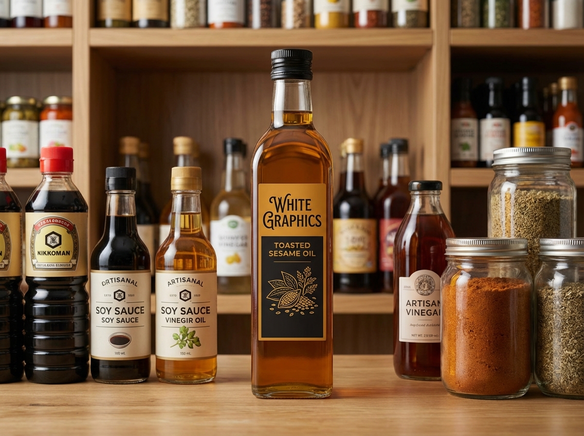
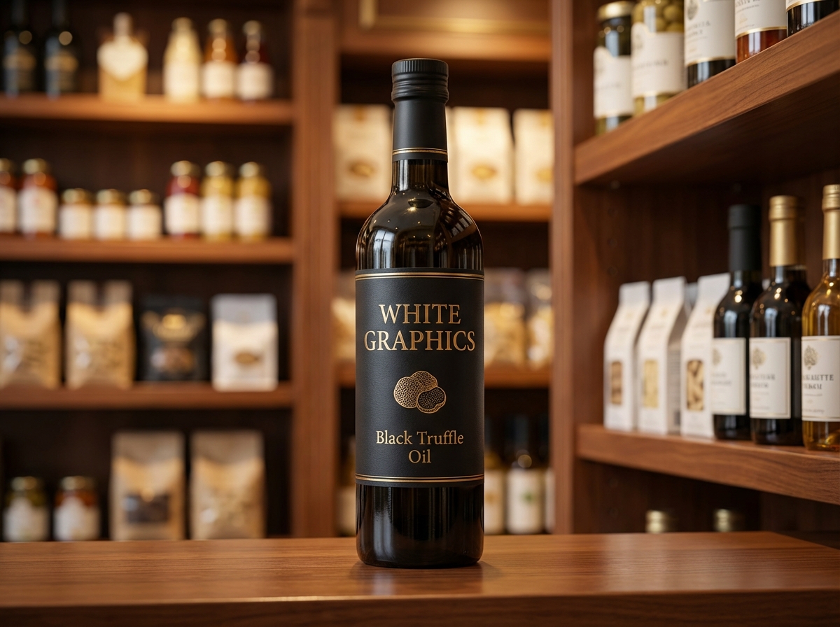
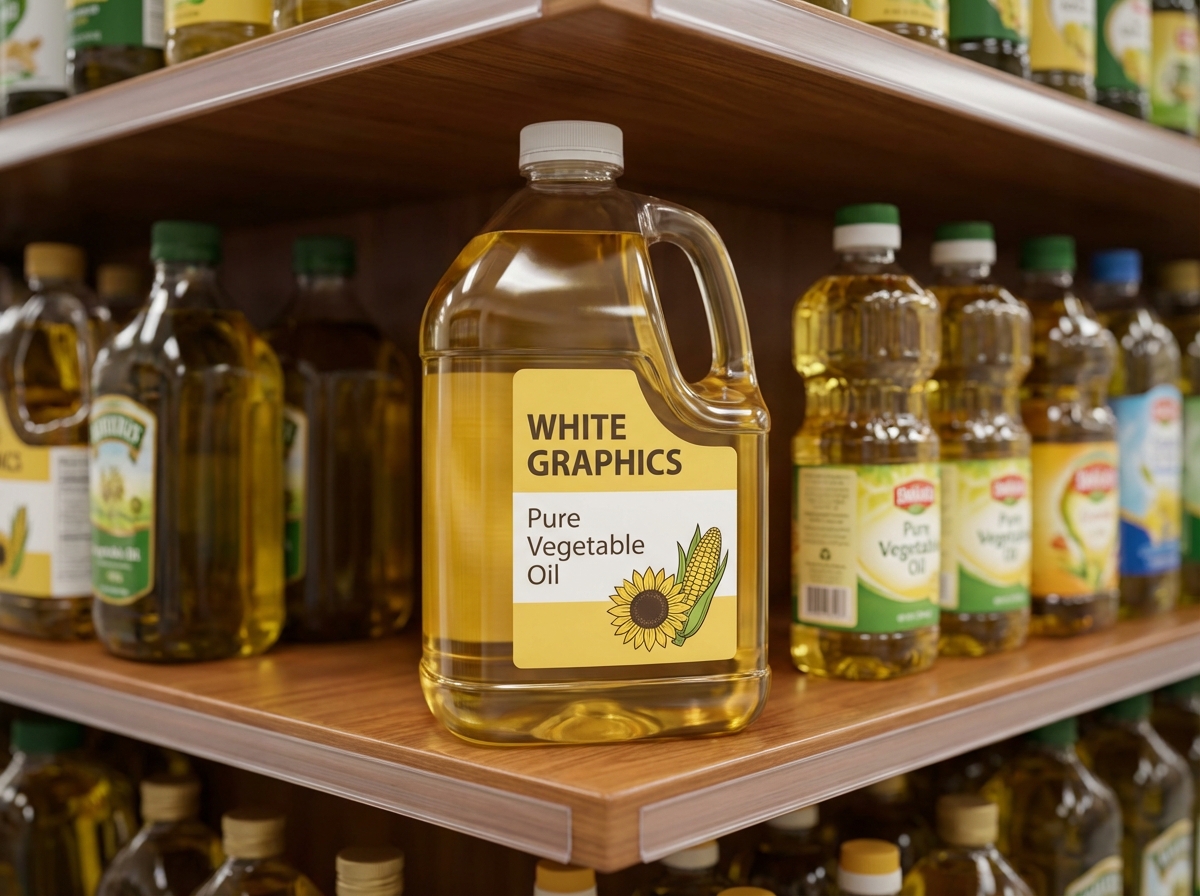
Cooking oil labels that resist oil creep – sealed estate papers and films, FDA-aware layouts for oils and infusions, and G7 color harvest to harvest.
Contact us for pricing, minimum quantities, custom specs, and turnaround times.

Color Accuracy Guaranteed
Oil label artwork tends to arrive handsome: an estate crest, a textured paper pick, type that earns the top shelf. The category’s quiet enemy is the oil itself, and it finds every weakness in that design. It creeps under label edges, softens weak adhesives, and stains uncoated paper on the first pour. So we build custom cooking oil labels for olive oil houses, specialty-oil brands, and infused-oil makers to shrug all of that off, and our cooking oil label printing pairs the premium look the olive-oil shelf demands with G7® Master Certified color from Naperville, Illinois.
Oil label sizes for marascas, tins, and jugs
Tall glass, square tins, foodservice jugs: the die follows your container, not a chart. We offer front-and-back sets for 250–750 mL marasca and dorica glass, panels for square tins, neck bands, and large labels for foodservice jugs.
Shapes
Tall rectangles for slender glass, arches, ovals, neck bands, and custom die-cuts that echo an estate crest.
Materials
Durable white films for working bottles, and textured estate papers sealed under laminate so oil can’t wick into the fibers.
Finishes
Matte or soft-touch laminate with a spot-gloss detail: the quiet-luxury finish the oil aisle rewards.
Formats
Bottling-line rolls with front, back, and neck labels run together.
Dark glass hides fill levels but shows fingerprints. Tell us the bottle and we’ll spec a finish that stays clean-looking.
Why oil bottles shed their labels
Every pour leaves a trace of oil on the neck, and gravity walks it down the bottle. From there the damage runs two ways: chemically, softening adhesives until corners lift, and cosmetically, staining any unsealed paper it touches. Our oil builds seal the face stock, use adhesives rated for oily surfaces, and keep the die’s edges away from the drip path where the design allows. The bottle on week twenty of kitchen duty still looks like the one on the shelf.
Vintage character, press-controlled color
Specialty oil sells on provenance, and provenance reads through consistent, confident design. The deep greens and warm golds the category leans on hold identical across harvests and reorders (that’s G7® Master Certified calibration at work), so this year’s pressing sits next to last year’s looking like family.
Oil labeling, from identity to origin lines
Cooking oils follow FDA food-labeling rules, with a few category habits worth getting right. Element by element, the layout goes down to spec:
- Statement of identity: the common name, with grade and style wording set the way your advisor approves it.
- Net contents in fluid measure: dual-unit declaration on the front panel.
- Ingredient list: a single-ingredient oil keeps it short; infusions declare every addition in descending order.
- Nutrition Facts: the current panel format, sized to the bottle.
- Origin and harvest claims: where sourcing and harvest-date lines appear, we set them legibly and consistently across the line; the claims themselves stay yours to substantiate.
- Allergen watch for infusions: nut and sesame infusions bring declaration duties plain oils don’t have.
The governing document is the FDA’s food-labeling guidance; we typeset what your advisor approves, and the claims stay their call.
Oils and everything they pour on
We print pressure-sensitive labels for olive oils, avocado and specialty oils, infused and chili oils, ghee and cooking fats, and vinegar companions. Related categories: vinegar & dressing labels, salad dressing labels, and fit-engineered bottle labels. Or browse everything we print for the pantry.
Artwork for tall glass and small panels
Tall, slender glass punishes sloppy alignment; a half-degree lean reads crooked from across the aisle. Oil label geometry gets trued in prepress before it ever prints. Files should carry real straight-panel measurements, bleed, a safe zone protecting origin lines, and vector art (PDF, AI, or EPS) built CMYK at 300 dpi.
From estate artwork to oil-proof label
Oil labels run a deliberate path: prepress trues the geometry on tall panels, the die comes from your marasca or dorica’s real straight wall, and a GMG proof approves the deep greens and golds. The G7®-controlled run follows on laminated estate paper or film with oil-rated adhesive, and the edges finish sealed against creep. Front-and-back sets and neck bands run as one order.
Cooking oil label FAQs
Why do oil bottle labels peel at the corners?
Oil migrates under the label edge and softens standard adhesives. Oil-rated adhesives and sealed face stocks, our default oil build, stop the creep.
Can we still use a textured estate paper?
Yes, laminated. The texture reads through; the oil stays out of the fibers. It’s the standard trick for premium oil looks that survive use.
What extra copy does an infused oil label carry?
Everything a plain oil carries, plus a full ingredient list and allergen declarations where nuts or sesame are involved. We lay out both paths to spec.
Do you print harvest-date and origin lines?
We do, including per-batch variable printing when each pressing carries its own harvest data.
Can you label square tins and jugs too?
Yes. Panels for tins, large-format labels for foodservice jugs, all matched to the bottle line’s design and color.
Do you print short runs for a single pressing?
A single pressing is a normal order here. Harvest-sized quantities scale to distribution volumes with identical color on reorder.
What file format works for oil label artwork?
Vector-built PDF, AI, or EPS: CMYK, 300 dpi, bleed, die drawn from your glass’s straight panel. Prepress trues the geometry either way.
Quote your oil labels
Send the bottle spec and label direction. Oil-tolerant builds are the default here, and the quote reflects your actual bottles.
Request a QuoteRelated products
-

Salad Dressing Labels
Salad dressing labels for fresh and shelf-stable lines - oil-tolerant builds, allergen-aware layouts,...
-
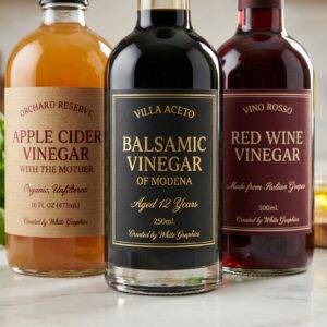
Vinegar & Dressing Labels
Vinegar labels with the acidity declaration set right - acid-tolerant builds for cruets...