
Last updated: September 20, 2026

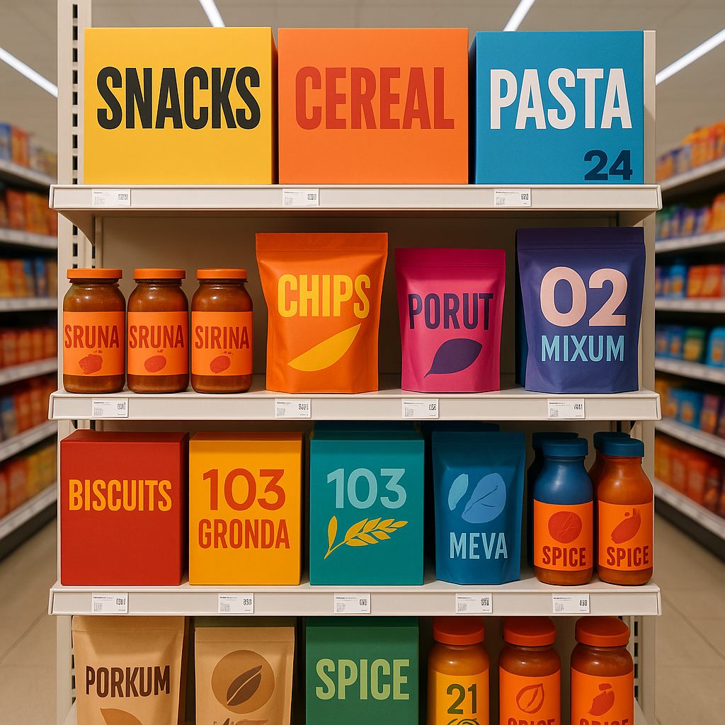
A shopper walking a category gives most products a couple of seconds at best. In that window there is no time to read a claim or weigh an ingredient panel. The package either stops the eye or it does not, and everything the brand spent on the product inside rides on that one reflex. The breakout names of the last few years, the challenger sodas and snacks and condiments that went from farmers-market volume to national retail in a hurry, did not get there on flavor alone. They got there because their packaging was engineered to win the glance.
Table of Contents
- Bold color, blocked with confidence
- Type that behaves like a headline
- One tactile finish, chosen on purpose
- The advantage nobody credits: color that holds
- Build it so you can reorder it
- The takeaway
- FAQ
The encouraging part is that the moves are learnable. Look closely at what the standout brands share and a short, repeatable playbook appears. Here is what is on it, and how to build it into a run you can actually reorder.
Bold color, blocked with confidence
The single most common trait on the breakout shelf is fearless color used in large, simple blocks. Not a busy illustration competing with itself, but one or two saturated fields that read as a shape from across the aisle. Color is the fastest signal a package sends, faster than a logo and far faster than type, because the eye registers it before it resolves anything else. The brands winning right now treat color as architecture, not decoration.
The discipline is restraint. A confident two-color block reads instantly. A package trying to use every color reads as noise and disappears into the shelf it was meant to beat.
Type that behaves like a headline
The second shared move is oversized, confident typography. The product name is set large enough to function as a headline, doing double duty as the graphic. When the name is the design, the package communicates in the same half-second the color bought, and the shopper knows what they are looking at before they pick it up.
This only works when the hierarchy is clean. One thing is biggest, one thing is next, and everything else gets out of the way. A package where five elements all shout is a package where nothing is heard.
One tactile finish, chosen on purpose
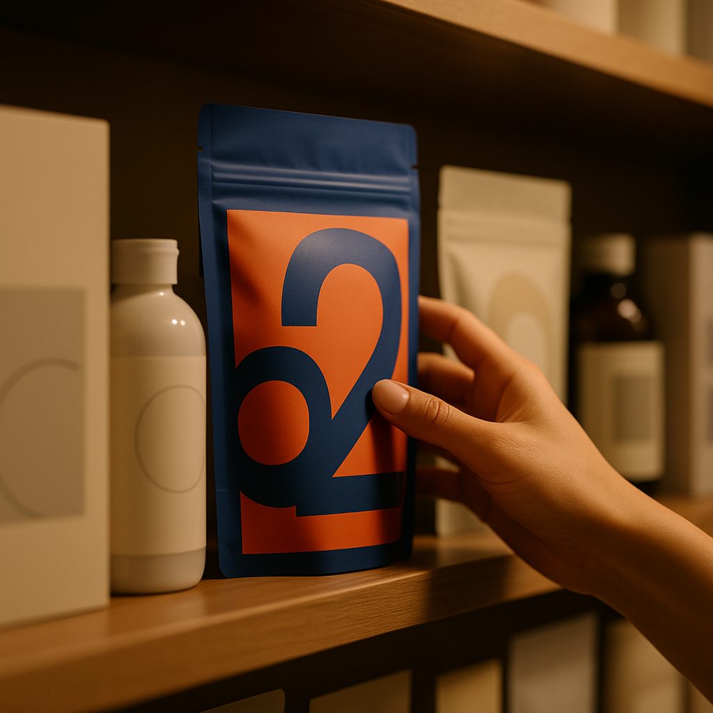
Color and type win the glance. What closes the gap between noticed and picked up is almost always something the hand registers: a soft-touch matte panel, a glossy spot accent that flares when the light moves, a shape you can feel raised or pressed into the stock. The standout brands rarely pile these on. They pick one tactile signature and commit to it, so the finish reads as a deliberate choice rather than a budget line. A single well-placed finish is the difference between a package that looks good in a photo and one that feels expensive in the hand.
The advantage nobody credits: color that holds
Here is the part that never makes the trend roundups and quietly decides whether any of the above survives contact with a real supply chain: the color has to be right, and right every single time the brand reorders. A signature red that drifts pink on the second run, or a calm navy that goes warm under store light, undoes every smart decision that came before it. Shoppers do not consciously notice consistent color, but they absolutely notice when a favorite brand suddenly looks a little off, and off reads as cheap. This is why the packages that look expensive are almost always printed to a color standard. We color-manage every job to G7 and GMG standards, so the bold block you approve on the proof is the bold block that ships, on this run and the tenth.
Build it so you can reorder it
Design for the shelf, not the screen. A comp that sings at full size on a monitor can vanish at three inches tall under fluorescent light. Judge the design at real size, at arm’s length, next to its actual competitors.
Prototype before you commit the run. A bold idea that looks right on screen can feel wrong in the hand. A physical proof, which we can typically turn within a week, tells you in seconds what a render never will. Our Xeikon label press and folding-carton prototyping let you hold the real color and finish before a full production run is scheduled.
Lock the color to a standard. The whole playbook depends on the brand looking identical every time it hits the shelf. That is a print-management decision made up front, not a thing you chase after the fact.
Give one element the win. Color, type, or finish, pick the hero and let it lead. The breakout packages are confident about what matters most, and quiet about everything else.
The takeaway
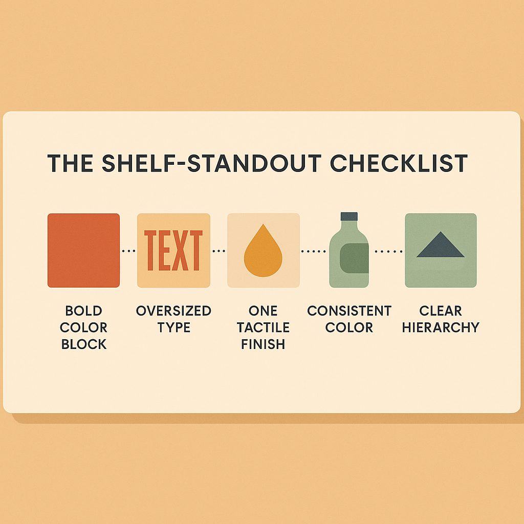
Winning the shelf is not a mystery and it is not luck. The breakout brands run the same short playbook: bold color blocked with confidence, type that acts like a headline, one tactile finish chosen on purpose, and color held to a standard so it looks the same on every reorder. None of these moves is expensive on its own. Together, executed cleanly and printed consistently, they are what turns a half-second glance into a hand on the box.
FAQ
What makes packaging stand out on a shelf?
Three things, in order: one or two saturated colours used in large simple blocks, a product name set large enough to work as a headline, and a clean hierarchy where one element clearly wins. A package trying to use every colour and every type size reads as noise and disappears.
How long do you have to catch a shopper's attention?
A couple of seconds at best as someone walks a category. That is not enough time to read a claim or weigh an ingredient panel, so the package either stops the eye on colour and shape or it is passed.
Does the finish on a package actually affect sales?
Finish is what closes the gap between noticed and picked up. Colour and type win the glance; something the hand registers, like a soft-touch panel or a textured stock, is often what turns a look into a pick-up.
How do I keep my brand colour consistent across reorders?
Lock it to a measured standard rather than to a swatch. Colour managed to G7 and GMG standards means the colour approved on the first run is the colour that reaches the shelf on the tenth, which is what stops a brand quietly reading as cheap over time.
Put the playbook on a real package
A design that wins on a monitor can disappear at three inches tall under store lighting, which is why the last step is a physical one. Request a quote from White Graphics to prototype the real thing, or see the six formats on the retail packaging page.
About the publisher
White Graphics is a G7 Master qualified custom label and packaging company managed out of Naperville, Illinois, serving food, beverage, supplement, cosmetic, and household-product brands across North America since 1972. Learn more about the company or see the full range of capabilities.
