
Last updated: July 7, 2026
There is a specific shade of blue that legally belongs to a jewelry company. A purple that a candy maker spent years in court trying to keep. A brown that a delivery company turned into an entire identity. Brands will fight to the Supreme Court over a color — and then hand that same color to four different printers, on four different substrates, and act surprised when it comes back as four different colors. The hard part of brand color was never picking it. The hard part is keeping it. If you sell a physical product, your color is only worth what your production partners can actually reproduce, every run, on every package you ship.
This is a look at why brand colors drift across packaging, why “we matched the Pantone” is a weaker promise than it sounds, and what it actually takes to make your red stay your red — from a shop that gets graded on this for a living.
Table of Contents
- Why brand color consistency is worth fighting for
- Why your color drifts in the first place
- The “we matched the Pantone” myth
- Same ink, different surface, different color
- What G7 and real color management actually do
- The hardest case: one color across labels, cartons, and displays
- How to pressure-test a printer on color
- FAQ
Why brand color consistency is worth fighting for
Color is the fastest-acting part of your brand. A shopper recognizes your color before they read your name, before they register your logo, before they’re close enough to read a single word of copy. That recognition is an asset you’ve paid for in every ad, every shelf placement, and every repeat purchase — and it only compounds if the color is the same every time. When it drifts, you don’t get a refund on the equity; you just quietly erode it.
The companies that treat color as a legal asset understand this instinctively. Signature shades get trademarked, defended, and obsessed over precisely because a consistent color does work that words can’t. You don’t need a registered trademark to benefit from that discipline — you need your packaging to actually hold the color you chose. The U.S. Patent and Trademark Office grants color marks only when a color has become a reliable identifier of a single source. Reliability is the whole game, and reliability is a production problem long before it’s a legal one.
Why your color drifts in the first place
Color drifts because “the color” lives in at least four incompatible places at once, and nobody reconciles them. It exists as the RGB version your designer sees glowing on a screen, the CMYK build in the print file, the spot-color ink a press actually lays down, and the finished result your eye reads on a shelf under store lighting. Each of those is a translation, and every translation loses something unless someone is controlling the math.
The screen is the first liar. Monitors emit light; packaging reflects it. A backlit display can show a saturated, glowing color that no ink on paper can physically reproduce — the gamut simply isn’t there. So the first time a brand color leaves the design file, it has to be squeezed into what print can do. If that squeeze happens by accident, in whatever software pipeline a given vendor uses, you get a different answer from every vendor. The fix isn’t a better monitor. It’s agreeing, in advance and in numbers, on what the color is supposed to be once it’s physical.
The “we matched the Pantone” myth
“We matched the Pantone” sounds like a guarantee. It’s closer to a starting point. A spot-color reference number tells a printer which ink to mix, but it doesn’t account for the substrate, the press, the lighting you’ll judge it under, or whether the job is even running as a spot color versus being built from process inks. The same reference number can land in noticeably different places depending on every one of those variables.
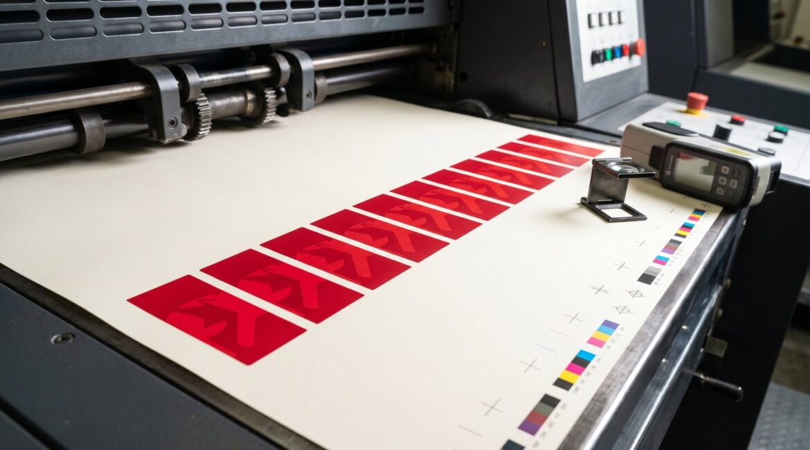
Two things quietly wreck the promise. First, a lot of packaging color isn’t printed as a premixed spot ink at all — it’s simulated by overlapping process inks, and a process simulation of a spot color is an approximation with real tolerances. Second, a swatch in a fan deck was printed on coated paper under standardized lighting; your product might run on an uncoated carton, a film pouch, or a reflective film label viewed under warm retail LEDs. The number didn’t change. Everything around it did. A printer who says “we matched the Pantone” and stops there is describing an intention, not a controlled outcome.
Same ink, different surface, different color
The single most underestimated variable in brand color is the surface you print on. The exact same ink reads brighter and sharper on a coated stock, softer and more muted on uncoated, and different again on a clear film or a textured paper, because the substrate decides how much light gets absorbed versus bounced back to your eye. This is physics, not sloppiness — and it’s why a color approved on a label can look “off” on the folding carton even when both were printed correctly.
This matters most for brands that show up in more than one format, which is most brands worth talking about. Your retail packaging might span pressure-sensitive labels, folding cartons, and flexible pouches, each with its own surface behavior. Holding a brand color across all of them isn’t about printing each one “to the number” in isolation. It’s about characterizing each substrate up front and deliberately compensating so the human eye reads them as the same color — even when the measured values politely disagree.
What G7 and real color management actually do
G7 is a methodology for getting predictable, repeatable color by calibrating presses to a shared visual standard rather than to each operator’s judgment. Instead of “does this look right to whoever’s running the press today,” G7 anchors the gray balance and tonality of every device to defined targets, so the same file produces the same neighborhood of color across presses, shifts, and time. It’s the difference between matching a color once and being able to match it again next quarter.
What that buys a brand is boring in the best way: a reorder that looks like the original. A second press that agrees with the first. A proof that actually predicts the run. Color management built on G7 methodology and disciplined process control is the unglamorous infrastructure under every “wow, it’s exactly right” moment — and it’s why we treat color sign-off as a measured step, not a vibe. The standard behind it comes from Idealliance, the body that maintains G7 and certifies the shops that prove they can hold it.
The hardest case: one color across labels, cartons, and displays
The real test of a color program is a product that appears on a small label, a printed carton, and a four-foot retail display all at once — because each one runs on a different substrate, sometimes on a different press technology, at a different scale of detail. Get them slightly out of step and a shopper won’t articulate why, but the lineup looks cheap. Get them locked together and the whole presentation reads as one confident brand.
This is where a single-source production partner earns its keep. When the same shop characterizes the labels, the cartons, and the point-of-purchase displays against one color standard, the compensation across formats is intentional instead of accidental. Split that work across three vendors who’ve never compared notes, and you’ve signed up for three different reds — and a brand manager whose actual job becomes refereeing color complaints. A proof or a physical prototype that shows the formats side by side, before the full run, is the cheapest insurance in packaging.
How to pressure-test a printer on color
If color matters to your brand, the sales conversation should get uncomfortable fast. Useful questions to ask any printer you’re evaluating:
- “Are you G7 Master qualified, and how do you maintain it?” A certification with no maintenance story is a wall plaque, not a process.
- “How do you handle my brand color across different substrates?” You want to hear about characterizing each stock and compensating — not “we just match the Pantone.”
- “What lighting do you evaluate color under?” A standardized viewing condition should be a reflex answer, not a puzzled pause.
- “Will a reorder six months from now match this run?” The honest answer involves measured targets and retained data, not a promise.
- “Can I get a physical proof on my actual substrate before the full run?” For anything color-critical, the answer should be yes.
- “If my product runs in multiple formats, how do you keep them consistent with each other?” This is the question that separates a print vendor from a color partner.
For brands building a color program from scratch, our printing guides for brand and compliance teams are a reasonable place to get oriented before you start collecting quotes.
FAQ
Isn’t specifying a Pantone number enough to guarantee my color?
No. A spot-color reference tells a printer which ink to target, but the finished color still depends on the substrate, the press, whether it runs as a true spot ink or a process simulation, and the lighting you judge it under. The reference number is the start of a controlled process, not a guarantee on its own.
Why does my brand color look different on the label versus the box?
Almost always the substrate. Coated, uncoated, film, and textured surfaces each absorb and reflect light differently, so identical ink reads differently on each one. Holding a color across formats requires characterizing each substrate and compensating deliberately, not printing each one in isolation and hoping they agree.
What does G7 certification actually get me as a brand?
Repeatability. G7 calibrates presses to a shared visual standard, so the same file lands in the same color neighborhood across presses, shifts, and time. Practically, that means reorders that match the original, proofs that predict the run, and a second press that agrees with the first.
Can one printer keep color consistent across labels, cartons, and displays?
Yes, and that’s the strongest argument for single-sourcing color-critical packaging. When one shop characterizes every format against one standard, cross-format consistency is intentional. Split the work across vendors who never compare notes and consistency becomes a coincidence you can’t count on.
Want a brand color that survives the press floor?
If you’re tired of refereeing color complaints across vendors, it’s worth talking to a G7 Master shop that treats color as a measured outcome. Contact White Graphics to talk through your color program, or start a request through the label shop.
About the publisher
White Graphics is a G7 Master–qualified custom label and packaging company in Naperville, Illinois, serving food, beverage, supplement, cosmetic, and household-product brands across North America since 1972. Learn more about the company or see the full range of capabilities.
Related reading: Prototype packaging: the complete guide · mockup vs. prototype: which proves color?